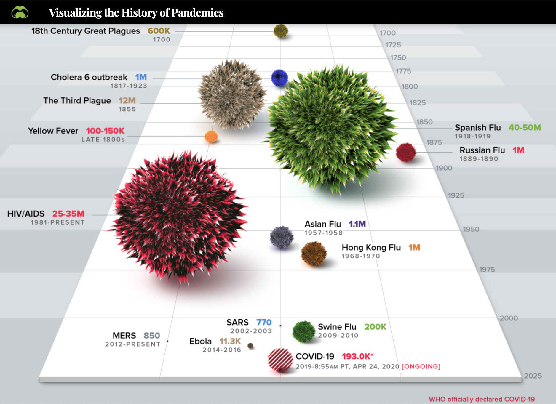
Found this odd visual of pandemics over time.
Source: https://www.visualcapitalist.com/history-of-pandemics-deadliest/
It is different than anything I have ever seen. I don’t think it’s easy to compare the sizes against each other, but death toll is expressed in numbers too. So it sort of shows history by looking back. I don’t know. The infographic has more when you go to the page and scroll down.
The article tells you about R0 and spread of diseases over the globe too.