How cool is this: A scarf that represents the temperature every day:
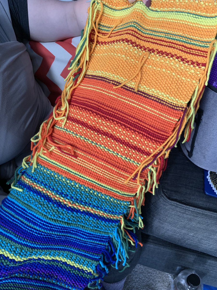
#CraftDataViz a friend of mine is knitting each day, each color represents the temperature and the stritch pattern represents the month! So cool!!!
Categories: blog Tags: visualisation physical inspiration
How cool is this: A scarf that represents the temperature every day:
#CraftDataViz a friend of mine is knitting each day, each color represents the temperature and the stritch pattern represents the month! So cool!!!